The real start of my bachelor thesis began with a readability test I created which showed that readers have more trouble to remember written content when set in Centaur compared to the fonts Corporate A and Swift.
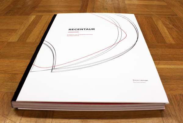
Thus in my bachelor thesis „recentaur“, I explored the the details in typographic design that makes type more legible. I reworked the Centaur typeface in several steps, constantly comparing the different drafts I worked out per step. The whole progress takes its theory from well-known type-designers, typographers and punchcutters. The historical background of Bruce Rogers as well as background information about Centaur, legibility and readability is collected together along with my type design in a self-bound book.
As a very critical designer, this project isn’t finished for me. In the next year I plan to elaborate all the letters needed to make another readability-test in order to see the how successful my reworking of the typeface is.
To see my bachelor thesis click here or scan the qr code in the banner.